
project. Safe Parking LA; Hackathon
date. 2019
city. Los Angeles
Client. Emily Kantrim, Safe Parking LA

First Place Hackathon Winners "Best in Show"
Brief:
In Los Angeles County, there are over 15,700 people living in their vehicles each night. These vehicle dwellers represent over 25% of the population of people experiencing homelessness in LA County. We were tasked with re-organizing and administering the crucial info. SPLA receives from applicants in order to tackle the untidy backend, but also getting the most out of the least from these users' in order to assist them in the best manner.
Client:
Founded in 2016, Safe Parking LA is a coordinating organization for the community which assists homeless families and individuals living in their vehicles. We support the implementation of "Safe Parking Lots", which provide individuals a safe place to park each night, restroom access, a security guard, and social service resources.
Roles:
UX/UI Design
Form Creation
Stylizing
UX/UI Team:
Cathy Lee
Elizabeth Greenberger
Richard Rodriguez
Dev. Team:
Calvin Feau
Dominic Parducci
Platform: Responsive Web
Tools:
Whiteboard, Sketch, Photoshop, Zeplin, Slack, Google Suite, MERN stack, Bootstrap
Define and Discover
-
01 Intro & Research
Challenges
To not waste any time upon getting into groups, we took about three hours to get to the heart of the situation by getting to know Emily Kantrim of Safe Parking LA and the business itself. We asked deeply rooted questions regarding the issue at large, the organization's backend business, the policies put in place as far as city ordinances, etc. as this was going to be our prime source of all-around research.
Initially, our client tasked us with assisting them in re-organizing and administering the crucial information they receive from applicants seeking safe parking.
Jumping right into it, our team passionately understood that throughout this whole process, in order to achieve what could be the best solution for the issue presented to us, the true User Experience would have to begin at the granular level of code- with developers and designers needing to communicate eye to eye.
By the nature of SPLA's non-profit business, it was obvious to us as a team that we had to approach the issue holistically. By identifying the technical issues and correlating them back to the users at hand and much larger issue that SPLA combats, we could in turn not only assist the business, but successfully aid the users who are actually seeking for real help every day.
-
02 Analysis & Synthesis
Identify the User
To further research and truly tap into the world of our users, we looked into some first hand cases of individuals dealing with transitional homelessness. In addition, to get a better picture, we rounded up some current statistics for homelessness as a whole- specifically in Los Angeles city and county, as well as news articles showcasing some of the leading factors driving people into transitional homelessness.
We took to these empathetic findings to create our persona:

Scenario
Over the past few weeks, Sarah and her boyfriend have been fighting. Due to the tension, her boyfriend tells her to move out. Feeling stressed and overwhelmed; she quickly gathers her belongings, gets in her car, and drives off with Zeplin. Having this unexpected situation occur, she doesn’t have enough money to afford a motel. Feeling exhausted from the day, she decides that her best option is to park on the street and sleep in her car.
We dug deeper into Sarah's journey via empathy mapping in the form of storyboarding- watercolor and mixed media done beautifully by my teammate Elizabeth to highlight a) a potential moment for Sarah and b) the current status of SPLA's on-boarding:
Early in the morning, Sarah is startled to be greeted by an officer at her window.

He notifies her that she can't sleep in the car and gives her a ticket.
Scared and confused, she drives to the McDonald's parking lot nearby and looks up what to do on her phone.

Sarah lands on SPLA's site and begins the application.


Problem Statement
Sarah feels discombobulated with her recent situation and wants to find an immediate safe place for her to stay, as well as provide her with relevant resources, but is unsure of where to go or what to do.
How might we...
Alleviate some of Sarah’s stress by providing her with a simple form to complete, so we can assist her as quickly, accurately, and efficiently as possible?
Develop and Deliver
-
03 Ideation & Prototyping
Before actually tackling the issues regarding the application form and user information, we looked to simplify the homepage in order to create a more obvious and transparent introduction to the process. It was important to present a well positioned navigation and clear calls to action paired with motivational copy and heartfelt imagery of various individuals.

My teammate Cathy went on to design the homepage while I simultaneously took on the creation of the application form.

In looking at the redesign of the website, we noticed that SPLA stated,
"Our mission is simple. We want to end homelessness through private support and efforts. It will be faster, less expensive and the most humane solution to care for our homeless neighbors and avoid some of the bureaucracy of government."
We expanded our thoughts beyond the scope of the initial project and deemed it beneficial for the organization to expand their B2C services to B2B partnerships.
By showcasing outreach opportunities on their site, SPLA would be able to provide the ability for businesses and other private entities to offer their resources and parking lots.
This would allow for:
-
higher ability to assist more individuals
-
quicken the application process and wait time
-
push their mission of bringing the community together to fight the battle against homelessness.

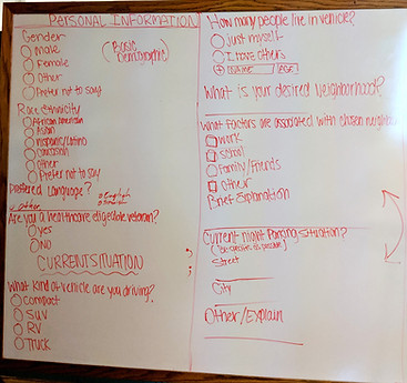
Getting to the forms, we knew that the responses users provide are often difficult to understand, and result in scattered information on the backend. This makes reviewing applications more time consuming and strenuous to sort and filter through for SPLA.
We hypothesized that by simplifying the form, we were better able to:
1. Extrapolate the most important information received
2. Speed up the process of intake
3. Categorize high risk-low risk cases automatically
4. Shorten user interview process
With the help of my teammates Elizabeth and Richard who worked more heavily on the research pertaining to information science and specifically dissecting the current form, we collaborated on more user friendly copy and components so my design of the forms could best utilize information management.


With the developers, we wanted to deliver a database that would first and foremost, organize the information in a manner that would take each case and input, then prioritize and categorize the candidates by possible risk for quicker assistance.

In addition to topics of risk, it was important for us to help SPLA get notified of individuals with issues that may lead them to not be accepted for the program- such as an expired drivers license.
With that, we placed the most needed information on the first page and setup the form in a bifurcated manner so that not only is it more user friendly, made up of short steps over long format, but if someone were to at the least only fill out the first page and press "Next," and then in distress decide to exit out- SPLA could still receive the completed information which would allow them to reach out and attempt to assist that individual regardless.
Our client mentioned that currently it can be difficult to decipher where a user might actually be in comparison to available parking lots and so we provided this new form- prior to the added introduction for added transparency, with a request for location in order to best assist every user.


Back to Sarah feeling confused and alone.
Partnered with comforting and empowering words- it was crucial to get resources across to our users for immediate action upon finishing the application so they may take preceding steps if need be rather than just wait for an answer.
Our UX/UI team implemented component-based thinking throughout the entire design process in order to create a seamless handoff to our software engineers.
Even through ideation, we kept a very open conversation with the developers in order to stay on track and realistic with what we could all actually achieve within the parameters of the hackathon.
Final Solutions
-
04 Process Complete

With simplified solutions, we were able to refine the backend work for Safe Parking LA and more importantly, heighten the user-friendliness and transparency in the service and assistance that SPLA seeks to present to their at-risk users.
By simply restructuring and rewording the way that SPLA presented their good-hearted work, our team was able to take a specific technical issue and holistically expand on the creative solutions that could be added to the picture.
As a final push, we wanted to take the idea of community engagement we implemented and build preliminary wireframes for what could be a community forum through Safe Parking LA's website in order to further SEO and of course setup a platform for angelenos (and possibly outside businesses) connect and provide resources or assistance for one another.
Next Steps
Short Term
• Continue user research to accurately differentiate
who are our Medium and Low Risk users
• Set up a page as proper "one stop shop" showcasing Immediate care and resources at end of form
• Create process messages (email/text) based on criteria specific to each user, to be notified during waiting time
Long Term
• Expand on community outreach
• Increase transparency between organizations
• Evolve system to collaborate with other organizations so we can better organize and share client information, so that SPLA services can be maximized, and not duplicated, or overseen.